Our Logos
Before using the JMU Libraries logo, please ensure that you use the correct style and file type; and maintain safe space around the logo, minimum size, and other logo guidelines outlined in the JMU brand guide and summarized below.
Contact Emily Blake with any questions about logos or branding for JMU Libraries.
Stacked Logos
For Screens
Download Purple stacked, large font, purple PNG or stacked, large font, purple SVG
Download Black stacked, large font, black PNG or stacked, large font, black SVG
Download White stacked, large font, white PNG or stacked, large font, white SVG
For Print
Download Purple stacked, small font, purple PDF
Download Black stacked, small font, black PDF
Download White stacked, small font, white PDF
Horizontal Logos
For Screens
Download Purple Horizontal, large font, purple PNG or Horizontal, large font, purple SVG
Download Black Horizontal, large font, black PNG or Horizontal, large font, black SVG
Download White Horizontal, large font, white PNG or Horizontal, large font, white SVG
For Print
Download Purple Horizontal, small font, purple PDF
Download Black Horizontal, small font, black PDF
Download White Horizontal, small font, white PDF
Frequently Asked Questions
Which file type should I use?
- For screens: Logos with “Libraries” in a larger font will be used on screens, including presentations, social media, and web pages. The logos above labeled “For Screens” use RGB color and a larger font size for “Libraries.” The PNG files have safe space built in. If you use SVG files, add safe space around the logo.
- For paper: Logos with “Libraries” in a smaller font will be used on paper, particularly for official documents such as letterhead, business cards, and brochures. The logos above labeled “For Paper” use CMYK color and a smaller font size for “Libraries,” which meets JMU Branding requirements for use of our logo in print.
- For giveaway items: Logos with “Libraries” in a larger font will be used for printing on giveaway items such as pens and stickers. Contact Emily Blake if you need the Libraries logo for printing on giveaway items.
- Stacked vs. horizontal: Your choice of logo color and horizontal vs. stacked layout will depend on your preferences, contrast with the background color, and the context of where the logo will be used. Please contact Emily Blake if you need help choosing a version for your project.
What’s the best way to send our logos to someone outside our department?
Feel free to share a link to this page with anyone who needs access to our logo. Emailing large files as attachments can pose a challenge if they exceed the maximum size allowed by our email system or the recipient’s.
What are the main JMU brand guidelines for logo use?
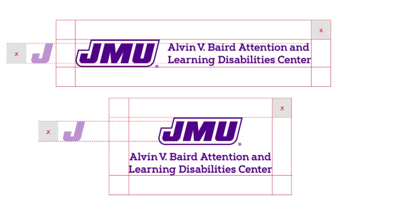
- Safe space: A mandatory “safe space” around the logo must be incorporated into any design using the logo. All our logo files (except SVGs) include the appropriate amount of empty space around the logo – this space should not overlap the edge of your design, other graphic elements, or text. The safe space for both the stacked and horizontal logos is defined by the height of the letter “J” within the block “JMU.”
- Minimum size: The logo may never be scaled so that the block JMU is smaller than .35 inches high.

- Color variations: The JMU Libraries’ logos may only appear in JMU purple, black, or white.
- Other guidelines:
- The logo must be displayed with the standard registration mark “®” by the “JMU.”
- The logo shall not be used as a background image or watermark.
- The logo shall appear proportionately and in its entirety. No part of the logo may be altered, tilted, skewed or stretched.
- When the logo appears on a dark background, the white logo version must be used.
- Do not remove or rearrange the elements of the logo.
- Do not crop or alter the logo.
- Do not add graphic elements to the logo.
- Do not compromise the legibility of the logo.
- Do not outline the logo.
Contact
These guidelines come directly from the JMU Logos & Marks page of the JMU brand guide from University Communications and Marketing, which is subject to change. Please ask Emily Blake if you have questions about any of these guidelines or any other needs related to logos.